01
Reality
Mixed media on paper · 2026
Mixed media on paper · 2026
Paper collage · 2026
Digital collage · 2026
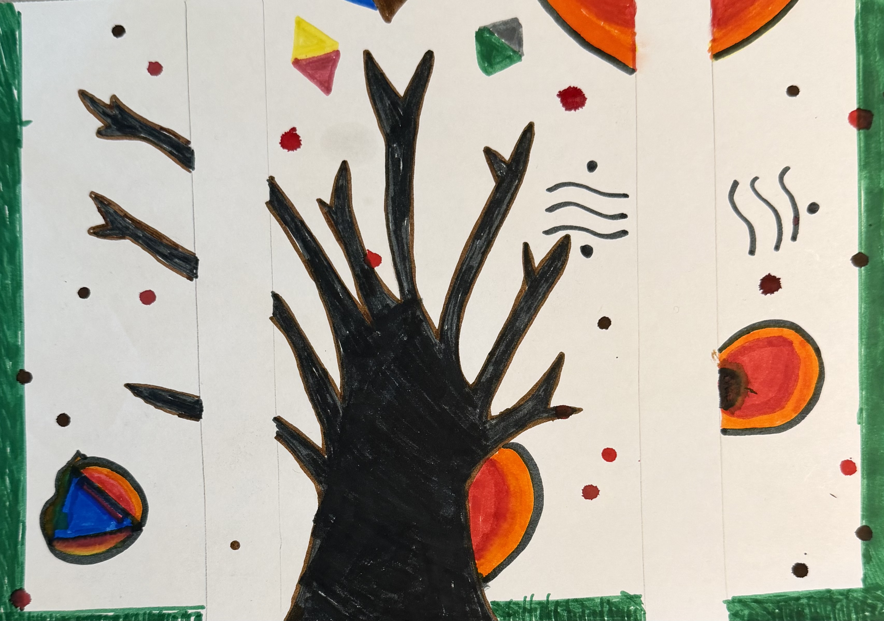
Mixed media on paper
2026
A hand-drawn tree surrounded by floating geometric shapes in bold colors. It explores the idea that everyone sees the world a little differently, and that what we call reality is never quite as fixed as it seems.
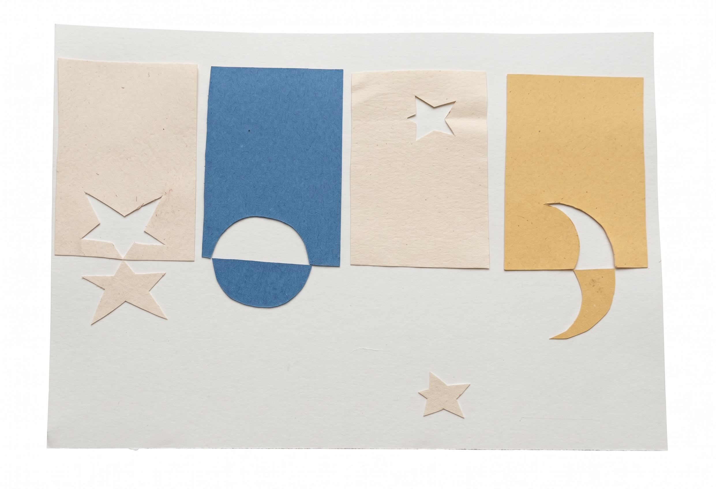
Paper collage
2026
Stars and a moon cut from paper, quietly arranged over a beige and blue background. It's about the moments that slip by without you noticing, and what stays behind when they're gone.
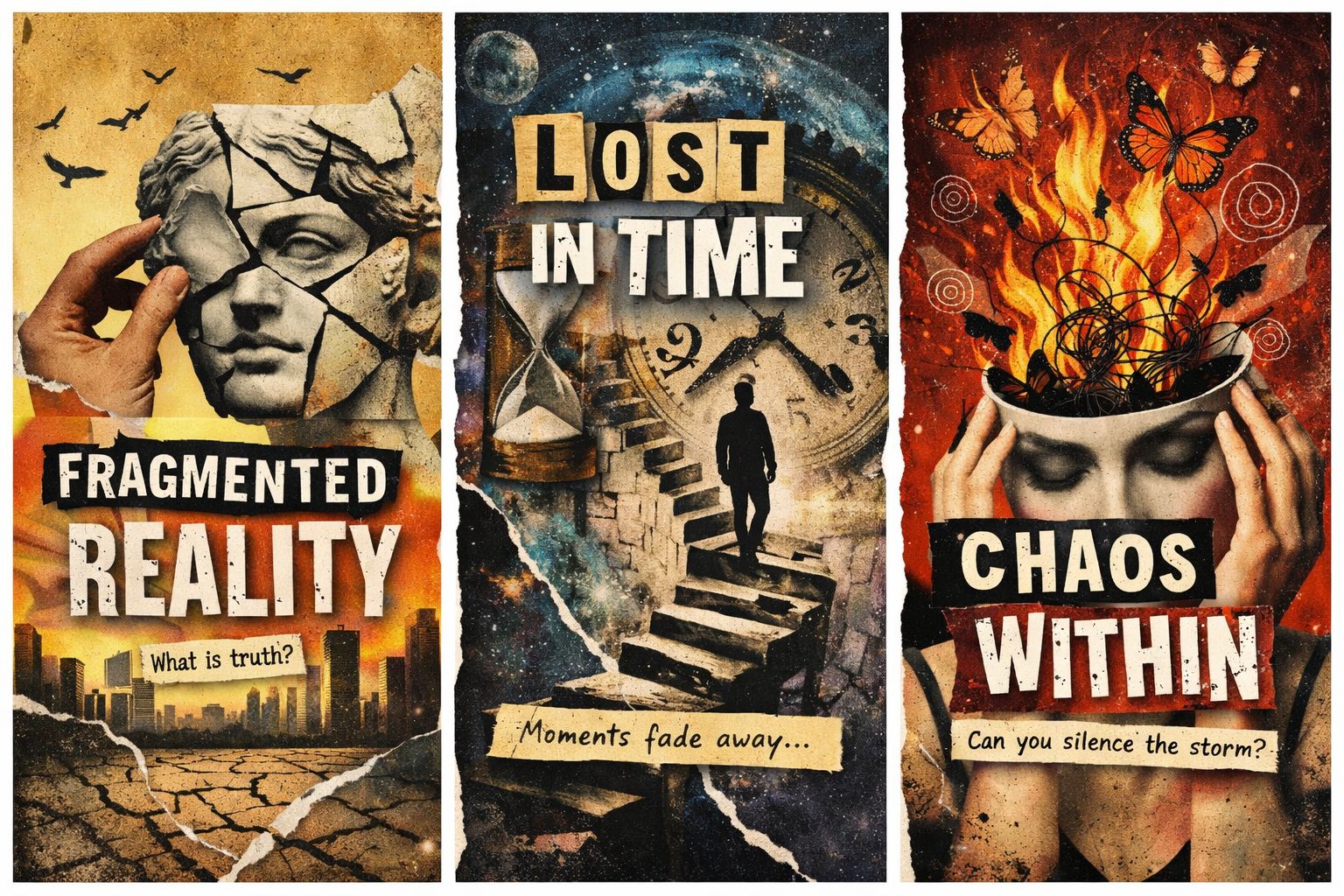
Digital collage
2026
Three images combined: fire, a figure climbing stairs, and a face held together by hands. An honest look at that feeling of inner disorder that sometimes has no explanation and no easy fix.
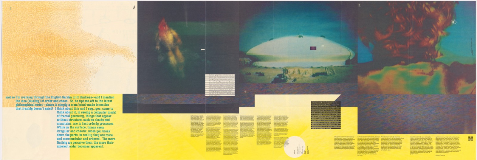
DOES IT MAKE SENSE? · Design Quarterly #133
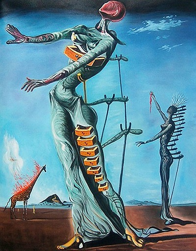
The Burning Giraffe · 1937
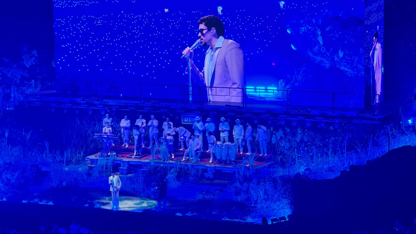
Performance Photography
DOES IT MAKE SENSE? (Design Quarterly #133)
1986
I was pulled in by how messy and "digital" it feels in a good way—like you're discovering the piece instead of just reading it. It's engaging because the type doesn't behave like normal text: it acts more like texture and noise, so your eye keeps moving. I like the layering and the weird scale shifts. I don't love how some parts feel almost too dense, where it's hard to know what to read first, but that also kind of fits the vibe.
It feels like a theme about technology, identity, and information overload—like the early computer era colliding with the human body and personal presence. Mood-wise, it's experimental, slightly disorienting, and curious, like it's asking you to question what "makes sense" in design and communication.
The overlapping layers and busy spatial layout create a feeling of overload and complexity. Scale changes (big image fields vs. tiny text blocks) build dominance and contrast, and the repeated blocks and grids help keep unity even when it looks chaotic. The pixelated, digital look and collage-like textures push the "computer-made" mood, while the folded poster format reinforces the idea of a system you unfold and decode.
The Burning Giraffe
1937
I picked Salvador Dalí's The Burning Giraffe (1937) because it seems strange but also serious. There are two tall women in the painting, and drawers are coming out of their bodies. In the background, there is a giraffe on fire. There is nothing around them, which makes everything feel lonely.
The long bodies make the composition look like it's stretched and not very stable. The blue background is calming, but the orange flames are very bright. I think the drawers look like thoughts or feelings that are hidden. The burning giraffe makes me feel like something strange is going on far away that no one is talking about. The whole painting has a quiet but tense feel to it, like a dream you can't quite put into words.
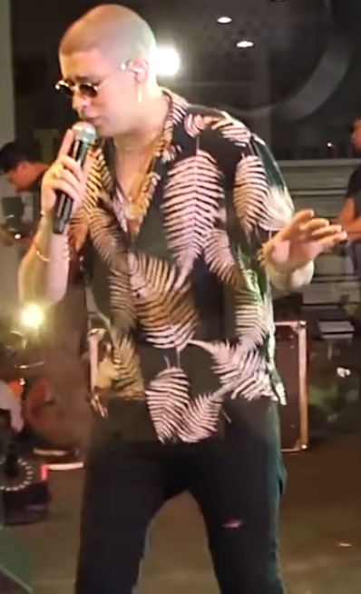
Performance Photography
Concert Series
The lighting, color, scale, and composition are the main things I notice in these two Bad Bunny performance pictures. Even though he's small on stage, the big screen above the stage makes him look bigger than life in Image 1. The dark blue and purple lights and the "star" lights in the background make the concert feel like an experience, not just a song.
Image 2 feels more personal because it's closer and you can see more details. The warm lights behind him make the scene feel more alive, and his outfit (the patterned shirt, jewelry, and sunglasses) makes him look calm and confident. His body language is also important: he's leaning in with the mic like he's really connecting with the crowd. I think these pictures show that Bad Bunny can switch between a big show and a more personal, in-the-moment style while still being true to who he is as a performer.
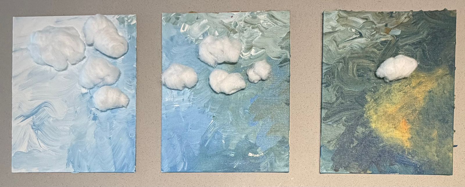
Something about this cloud felt like it was choosing to be up there alone, not lost, just far from everything for a little while. I made this piece thinking about those days when you want some distance from the noise without having to explain why.
Franco Yazigi. 22 years old, from Chile.